
JB Fire Protection
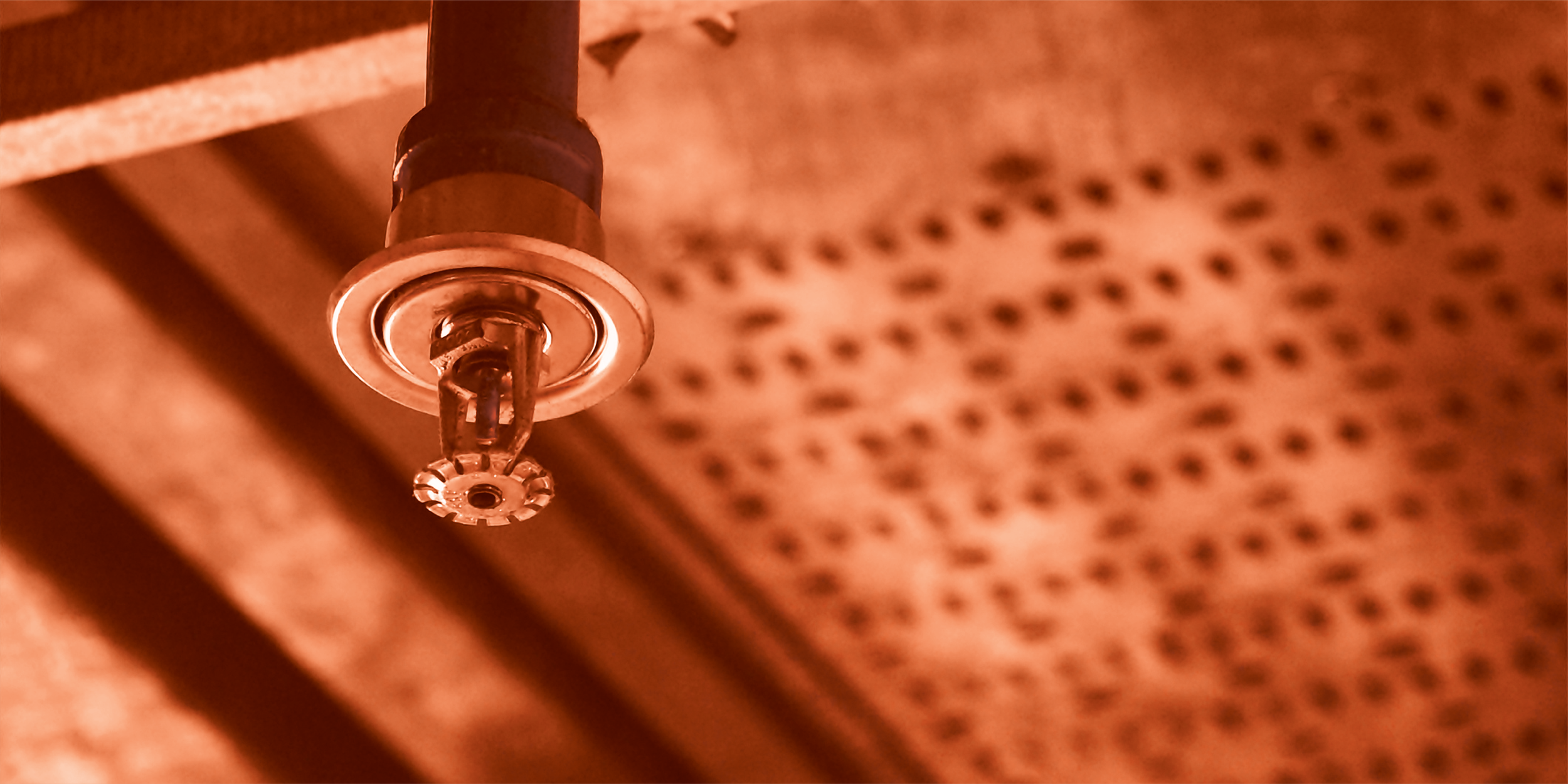
JB Fire Protection is a full service Fire Suppression company. They specialize in engineering, installation, service and testing of Fire Sprinkler systems, Fire Suppression Systems and Underground Fire Services including Fire Hydrants. The owner reached out to me looking to possibly re-design their existing logo with a more modern and simplistic aesthetic.
My goal here was to simplify all the pre-existing elements of their current logo, but trying to keep in mind what the core aspects of their business are and streamlining those in the new design. I wanted to use bolder and cleaner lines to express the modern feel and steer away from the more common design elements used by so many other companies in the industry. Most notably ‘flames’ since to me this imagery invokes the inevitability of a fire happening, when I believe that visually focusing more on the water aspect will ultimately convey safety and security that is achieved with a properly design fire sprinkler system. So if you were to choose JB Fire Protection, you will never see a fire.
Services Rendered: Logo Design | Business Card Design | Shirt Mockups

Existing Logo Design

First Re-design Concepts

Second Shield Modification

T-shirt Mockup for second design

After the first two attempts, they were still looking for a less stylized version, but liked the shield concept. I also wanted to bring attention to the main aspect of their business, designing and installing fire sprinkler systems, so I kept the shield but I then re-incorporated the sprinkler idea from the first design and used that as the outline. They also wanted a more simplified “JB” lockup that was easier to read. These adjustments greatly improved on the readability and simplification they were looking for and I believe we achieved a more modern look.

